The art in Promethea tells a story. In From Hell it tells a story. The first page of Watchmen tells a story. Unless this is the story of a reliable Ford Focus with a FM radio/CD player standard, this page doesn’t tell me anything about Alan Moore’s Neonomicon that I need to know.

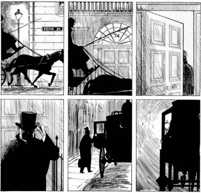
It’s a scene that takes place outside an asylum (…I assume it’s that afterthought in the distance?) but judging by the level of detail, the car’s center console and armrest are the two most important things in the scene. We don’t even see the faces of our protagonists. Also notice the eyes in the mirror reflect the eyes of someone who should be sitting in the driver’s seat. Sloppy.
Halfway through the comic, we get the next full-page spread, this time of Club Zothique. Now I have heard that Alan Moore is a pretty OK writer, and not one to skimp on detail for his descriptions — the first page of Watchmen was four script pages alone [PDF]. So I doubt there was any shortage of interesting angles the artist could have used, or inspiration to be had. And yet look at the result:

Totally flat. It may as well have read:
EXT. - CLUB ZOTHIQUE - NIGHT - A bad part of town.
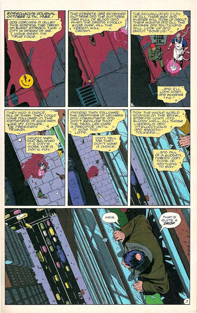
Not to bang the Watchmen drum again, but there was world building in those panels: “Quis custodiet ipsos custodes?” and “Cuba, the 51st state!” This street scene tells me nothing about the world to distinguish it from any other police procedural, even if it contained the usual “Fhtagn R’lyeh ai ai!” gibberish.
The framing is especially poor. Look at all the negative space at the top and bottom; an undercover police van (I assume) off to the side, and a collection of anonymous characters we won’t meet. You could have a tilted angle; an easy way to show the place is a little ‘off’. An extremely low angle to make the building more ominous, a high angle, to make the people look insignificant, even have them overlooked by a Lovecraftian stone gargoyle on the roof, adding character to the church. A high position showing the church in the foreground and the neighborhood it hopes to spread its malevolence into in the background — these are all off the top of my head, mind you — and despite all these possibilities, what we get is “EXT. CHURCH”?
Why should I be interested when the art is telling me ‘This is just a building’? The structure itself is mostly featureless, like it was poured concrete. It’s supposed to be an abandoned church from the 1920s, and this is all the character it’s given. The building to the left is scarcely more than a collection of rectangles, and it’s colored such that it merely blends in with the street and the sky, like it’s embarrassed to be there.
Ah yes, the colors. Inoffensive. Muted. Purple and tan. They aren’t even complimentary, so I don’t know what mood the colorist is going for. Add to that the drab palette and flay grey walls, and you have a comic that is at first glance a dull read.
I was expecting something more stylized, befitting the source material. Maybe I’m just making a knee-jerk reaction, and the art will begin to appropriately unravel as the characters delve into this world, and we readers are in for a treat. But until then, I have to give Boom! Studios’ Cthulhu Tales the edge purely on style alone (and Boom! is not known for their artwork).
3 replies on “The indescribable banality of Neonomicon‘s artwork”
You’re missing a lot. Look at the panels within panels, the seperate levels of reality. This is a Lovecraft thing after all.
I would be glad to have these panels within panels pointed out to me.
I read the precursor, The Courtyard, where the artist at least stuck to a consistent format, and used some interesting angles and style. If there are any such layers of meaning in this issue, they are certainly well hidden.
The idea that there are separate levels to the work alone is hard for me to believe considering the rest of the work hasn’t struck me as particularly nuanced or subtle.
There’s a great video-review on youtube detailing the crazy things going on with the comic’s geometry.