Skip to the content
Search
TimToon
@timtoonstudio
Menu
Lego
Series
Assignment: Unexplained
Emergency 411
What Would Jesus Do?
Shorts
Have You Seen This?
Games
Comics
Blog
Contact
Search
Behold my works.
LEGO
Comics
Games
Animation
Video
Podcast
 LEGO
LEGO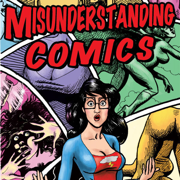 Comics
 Games
Games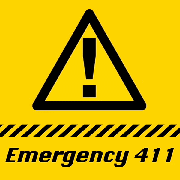 Animation
 Video
Video Podcast